Theme Color
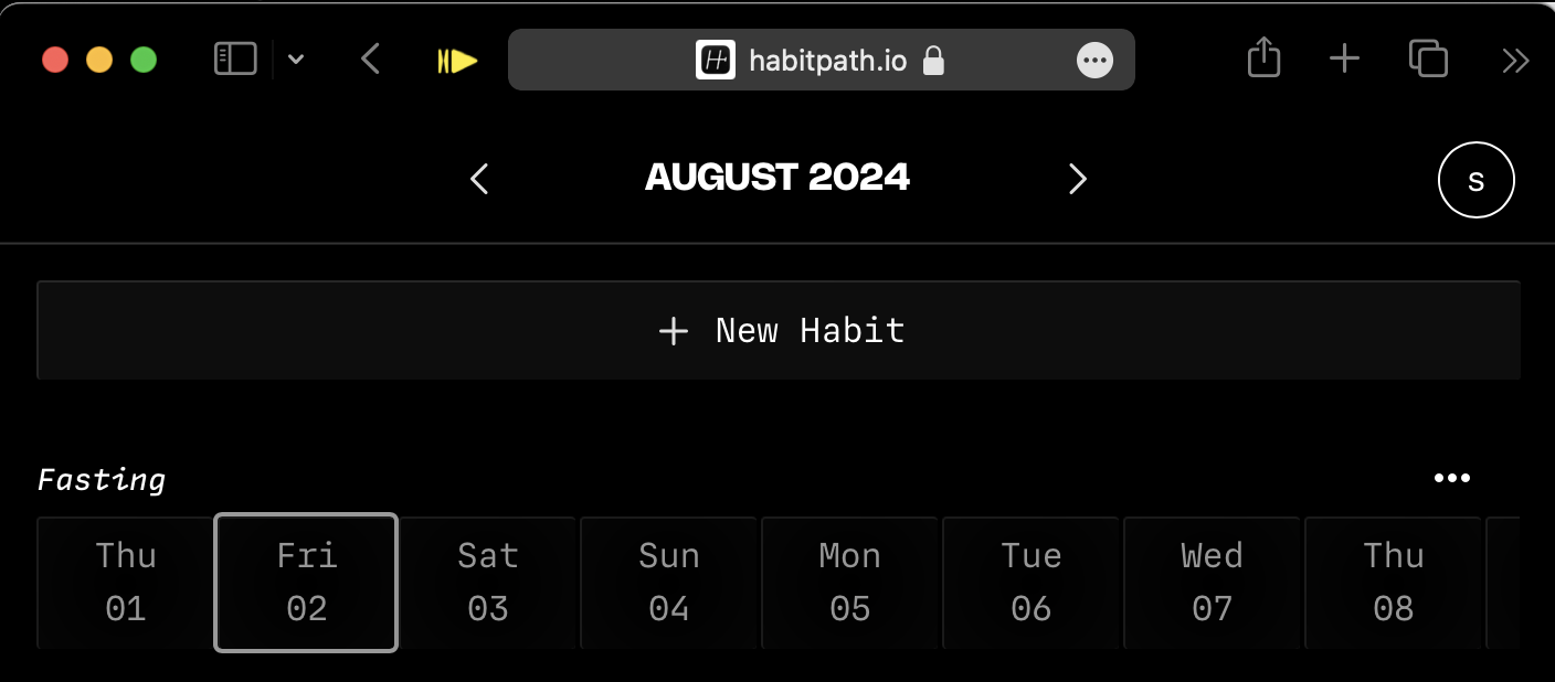
Have you ever seen websites that change the browser’s header color? Specifically mobile chrome, Safari on iOS and MacOS.
Notice how the header hear matches the background of the color.

So how do we do this? It’s very easy with a meta tag.
<meta name="theme-color" content="#00ff00">
Just include this bad boy in your in your <head> and you’re all good.
If you’d like to set this dynamically with JavaScript it’s just
document.querySelector("meta[name='theme-color']").content = '#00ff00';
Note, you can’t use css vars here, which would make this dynamic color easier.
Media Prefers Color Scheme
<meta name="theme-color" media="(prefers-color-scheme: light)" content="#ffffff" />
<meta name="theme-color" media="(prefers-color-scheme: dark)" content="#000000" />
You can also control for prefers color scheme light or dark. This can be handy for making dark and light mode look good. But we haven’t talked about color-scheme yet, so let’s talk abou that.
Color Scheme
https://developer.mozilla.org/en-US/docs/Web/CSS/color-scheme
Color Scheme is very interesting because even if you are theming websites with color, this helps with the contrast between light/dark/system colors. A common way to use this is by setting a color-scheme: light dark; in your :root CSS selector. What this says is that your element (in this case the :root) can be rendered as light and dark mode. This works very well with the next light-dark() that we’ll talk about next, but it also changes the default styles. So by simply adding
color-scheme: dark;
you get dark defaults. Let’s see this in action.
This demo is fairly trite, but notice how the initial font-color changes when you change the color scheme. This will even differ depending on if you have your system set to light or dark mode. For instance a value of “light dark” will use which ever you have selected.
light-dark()
Light dark is a function that takes two parameters, the light mode value and the dark mode value.
div {
	background: light-dark(#fff, #000);
}
In this example in light mode the bg is #fff, and in darkmode the bg is #000.
When paired with color-scheme, you can easily build interfaces that will always use the correct value based on the user’s settings. In a future post I’ll dig into some techniques for theming on top of light and dark mode with CSS vars.
accent-color
https://developer.mozilla.org/en-US/docs/Web/CSS/accent-color
Stying inputs is annoying for many reasons and many times we end up finding a way to transform the default input styles just to make them match our design. That’s not a problem but having to ditch the defaults just for things like color is a bummer. This is where accent color comes in.
accent-color changes the styles of input type checkbox, raido, range and the progress element. This can make inputs match your design without you having to completely redo the styling. That said, you will probably end up just styling your inputs anyways. 😅
caret-color
This is a small one, but you can adjust the text caret in form inputs with
input {
	caret-color: red;
}
Easy.
How to style Text Selection with CSS
Last but not least, you can style the text selection in CSS with this bit of CSS that you have to google every
All you need is to use the ::selection pseudo element. You can use it on it’s own like this
::selection {
	color: black;
	background: yellow;
}
You can also scope this to any selector with something like p::selection.
Ok
That’s all I have for now, in the next post I’ll be going deeper on how to combine these techniques with CSS vars to do theming.